
I’m going to tell you how to double your conversions by doing LESS.
Below are 10 examples of how simplifying content led to conversions increasing (and why this is especially important today, with so many people relying on AI for their marketing).
Yuppiechef - double the conversions
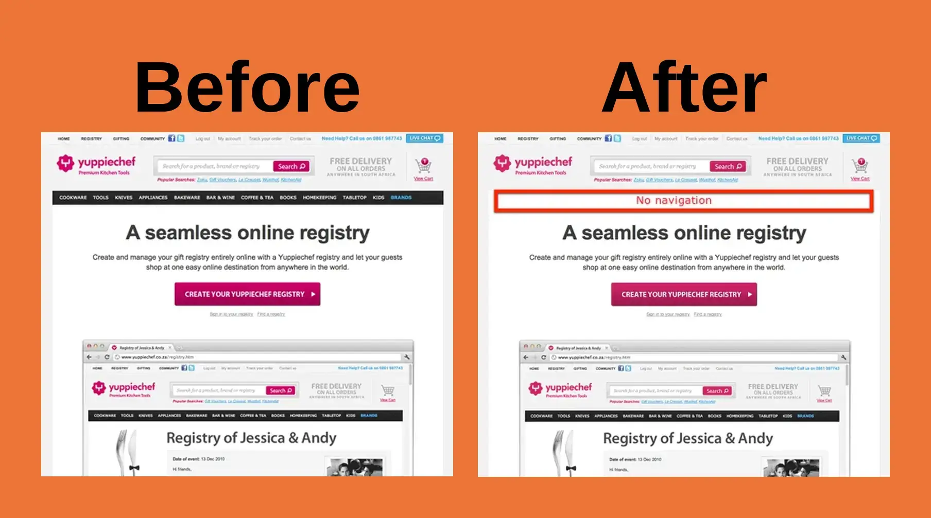
Yuppiechef removed the navigation on their wedding registry page, believing it would reduce distraction from their big button.
Conversions doubled from 3% to 6%.
Imaginary Landscape - well over doubled
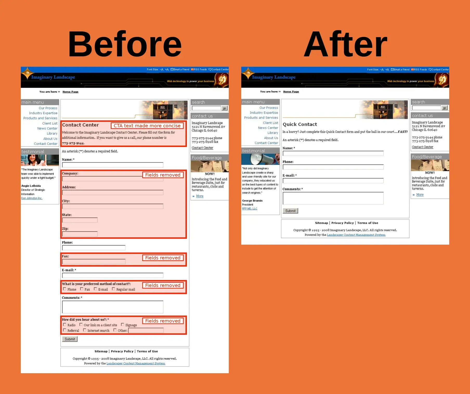
Imaginary Landscape’s contact page was made way more simple:
- 12 fields cut down to 4
- Introductory text made more concise, with phone number removed
Submitted forms increased 160%.
Career Point - more than quadrupled
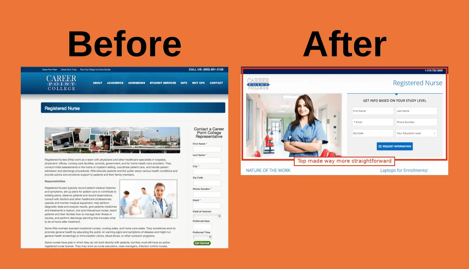
Career Point simplified the above-the-fold (before people start scrolling) to focus on getting visitors to request info about their nursing program.
- Removed navigation bar
- Moved form to top of page
- Cut form from 9 fields to 6
- Replaced nebulous photo collage with one big photo of a nurse
- Replaced small green “Get Started” button with big “Request Information” button
Conversions went from 3.12% to 13.64%, a 336% increase.
Bounce rate dropped from 32.5% to 28.7%.
Google Ads Quality Score rose from 8 to 10, which usually means cheaper clicks.
Humana - over 15x the clicks
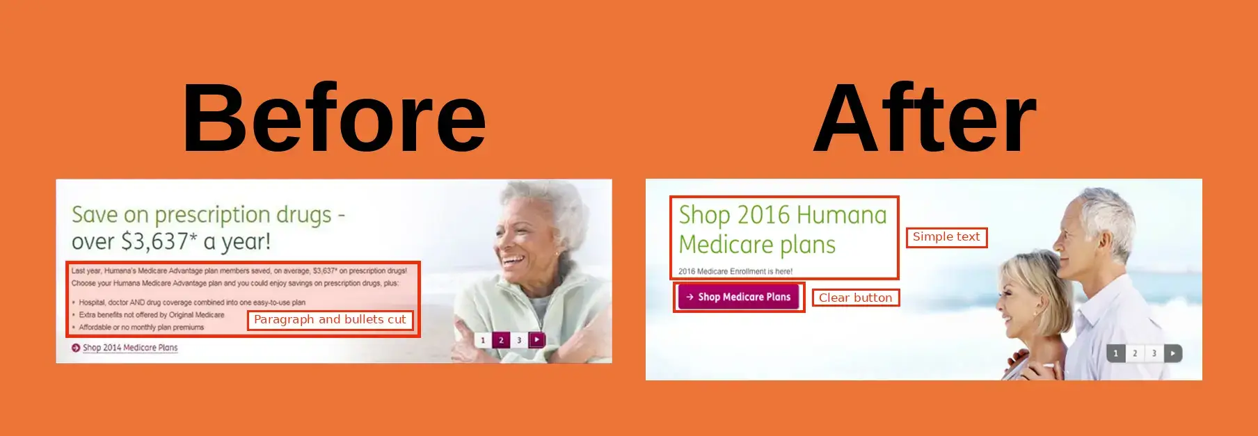
Humana simplified their homepage banner to focus on getting people to click and make it to the next shop screen.
- Paragraph and bullet points cut down to one short line
- Shorter, simpler headline in bigger font
- Replaced small “Shop 2014 Medicare Plans” text link with big bright button
- Slide counter made grey so it doesn’t compete with the button
- More empty space
Clickthrough increased 1,456%.
If you like this so far and would like to see more from my site in Google above the AI SEO slop my competitors are spewing out, please just hit this button below:
This literally makes my site preferred against other sites (and in CRO/SEO/marketing so many sites now are unproofread AI garbage (not mine!)).
Highrise - double the paid signups
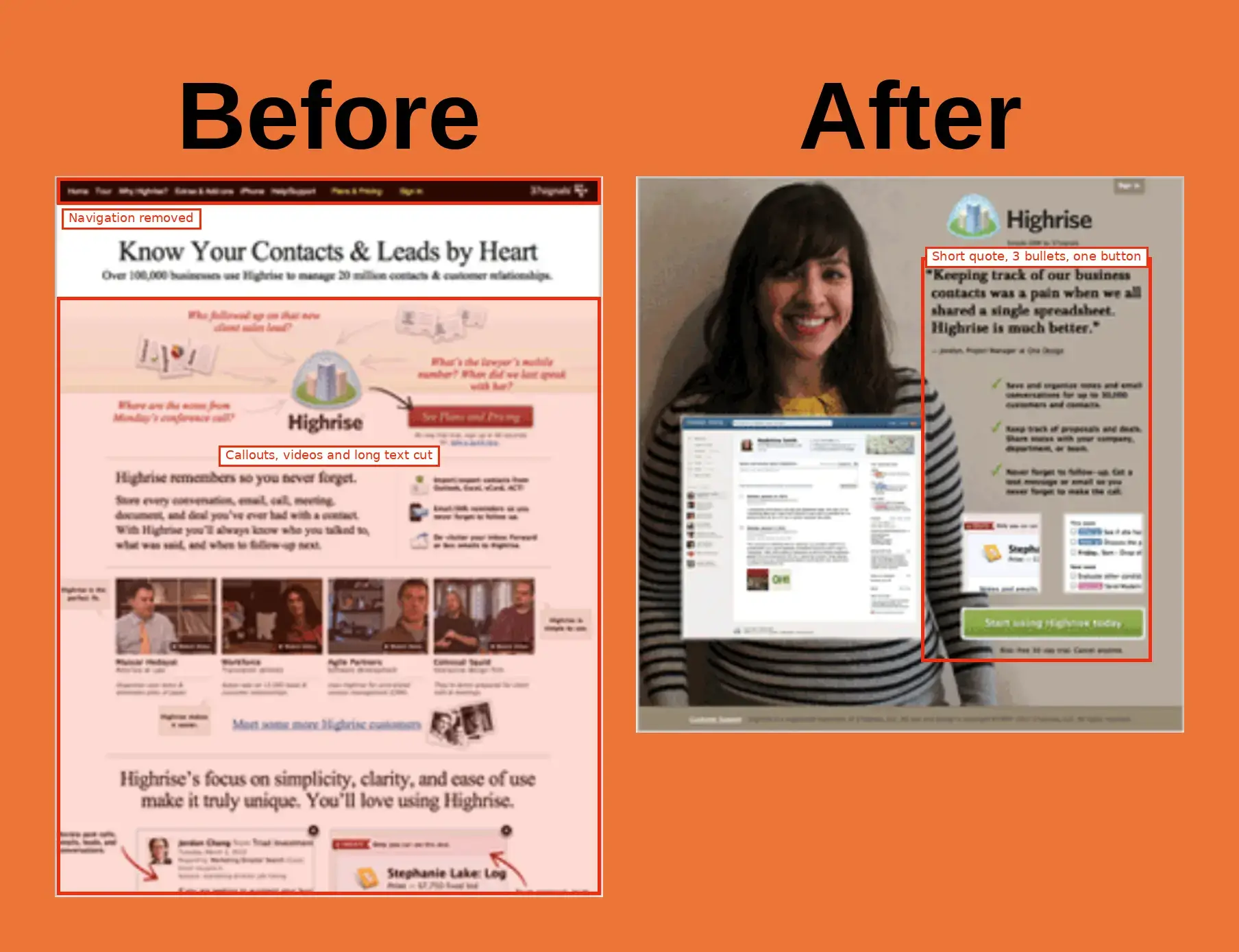
Highrise CRM replaced their busy homepage with a simple page built around one happy customer.
- Removed top navigation
- Cut a ton of text, video, and callouts
- One big photo of a real customer with concise customer quote
- Features cut down to 3 short bullets
- One big CTA button
Paid signups increased 102.5%.
Whirlpool - 42% more clicks
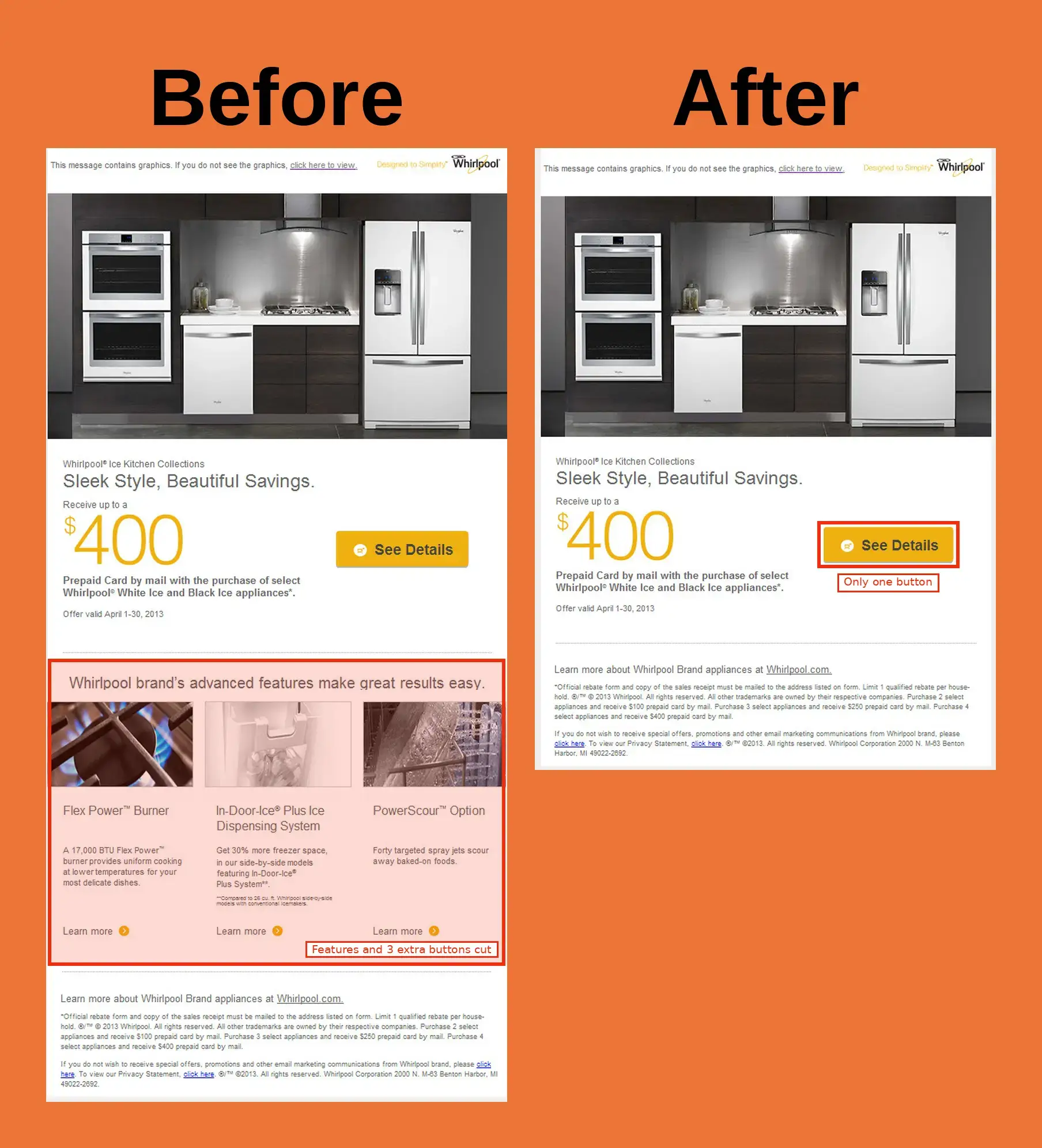
Whirlpool cut their promo email to focus on getting to the rebate page.
- Removed features section
- Cut 3 “Learn more” buttons, leaving only “See Details” button
Clicks increased 42%.
Why I put together this article
I made this video a couple days ago:
It got 180,000 views on Instagram and 108,000 views on TikTok. This is a comment I liked:

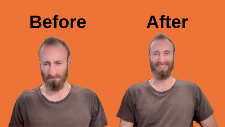
So this article is that – more before and afters.
And here are all the before and afters from the video:
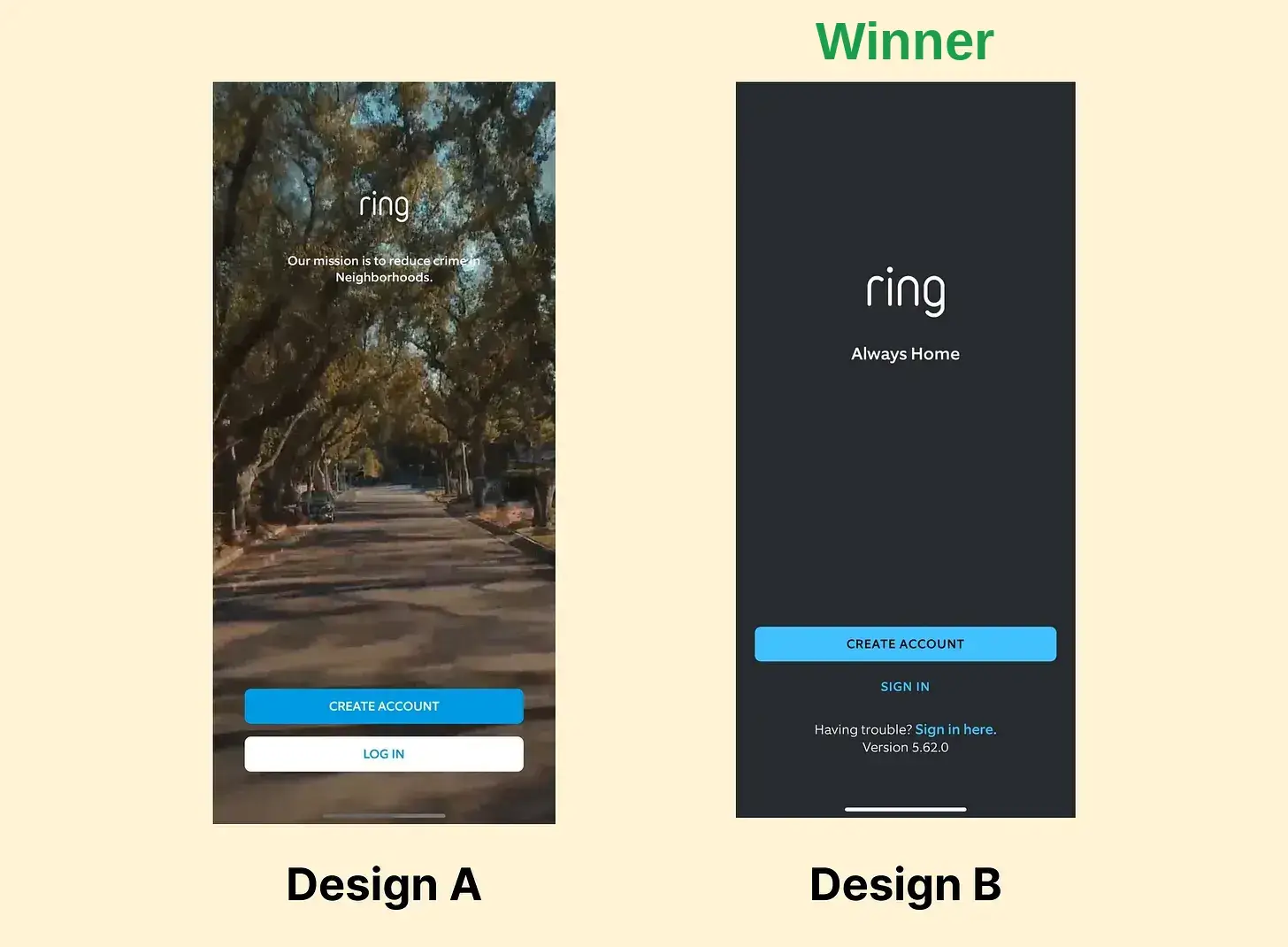
Ring removed the distracting moving video background from its create an account screen. More accounts were created.
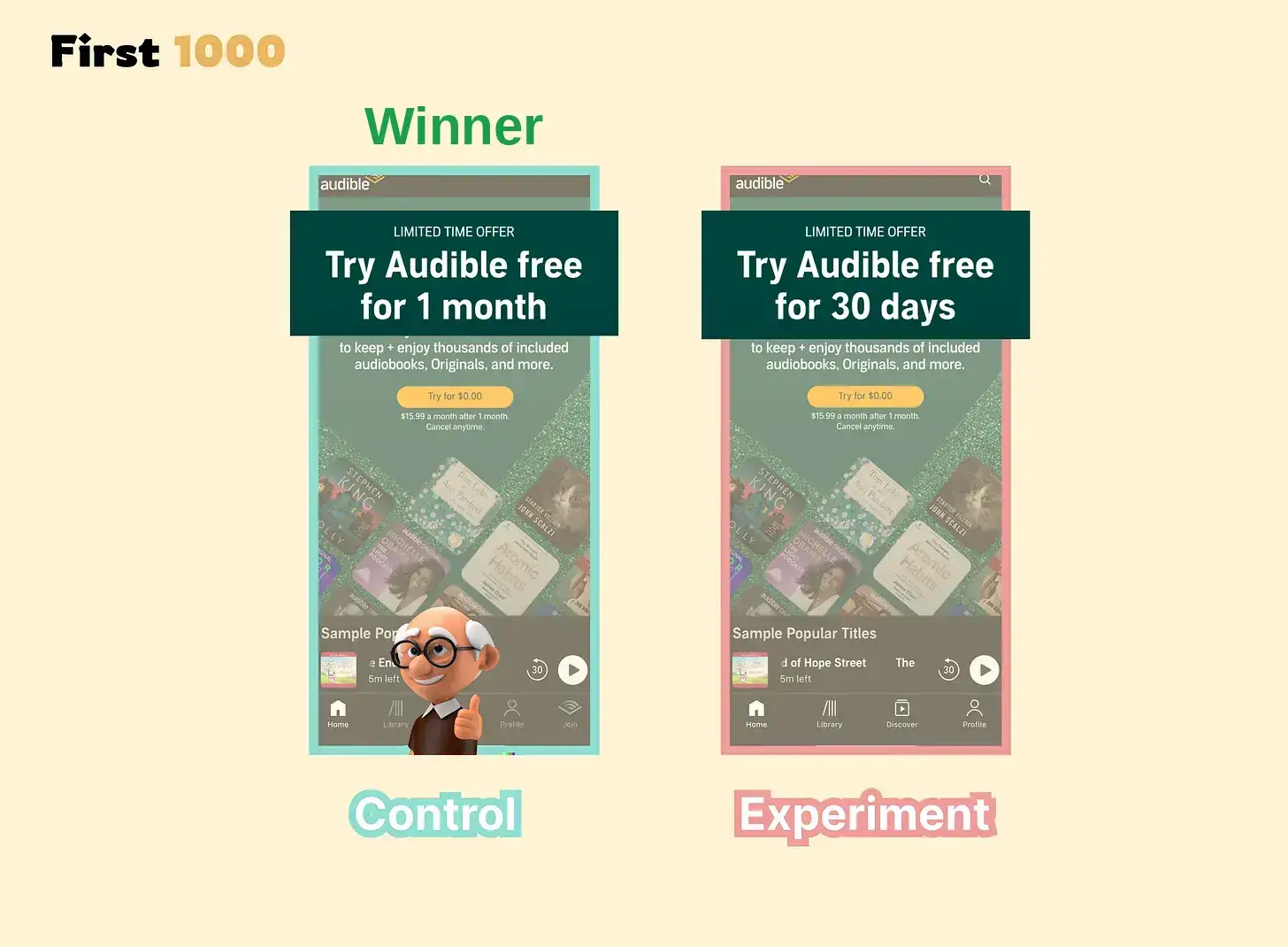
Audible found that “1 month” got more free trials than “30 days.” “1 month” is easier on the mind.
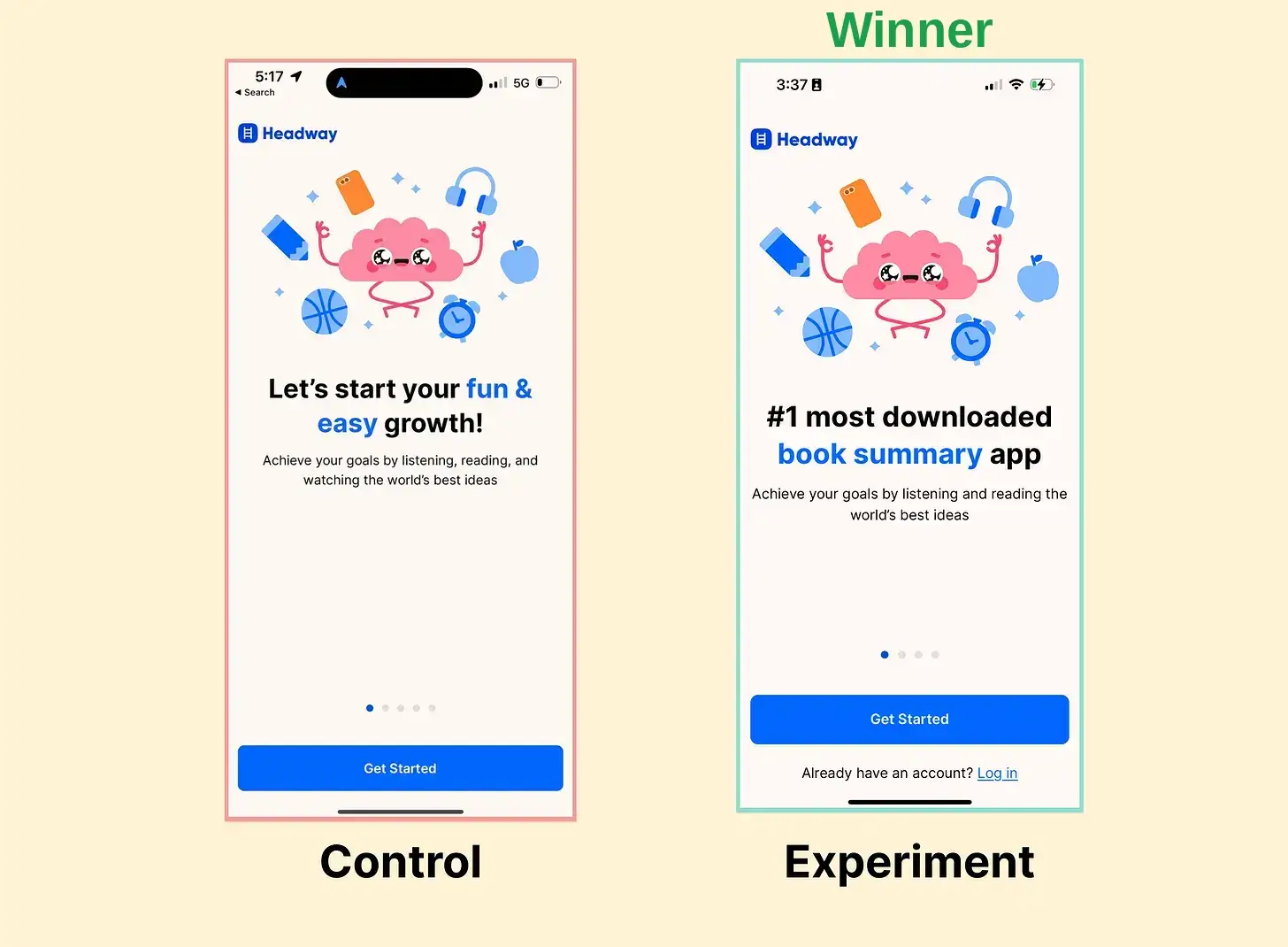
Headway’s big text was made more clear and social proofed. It crushed.
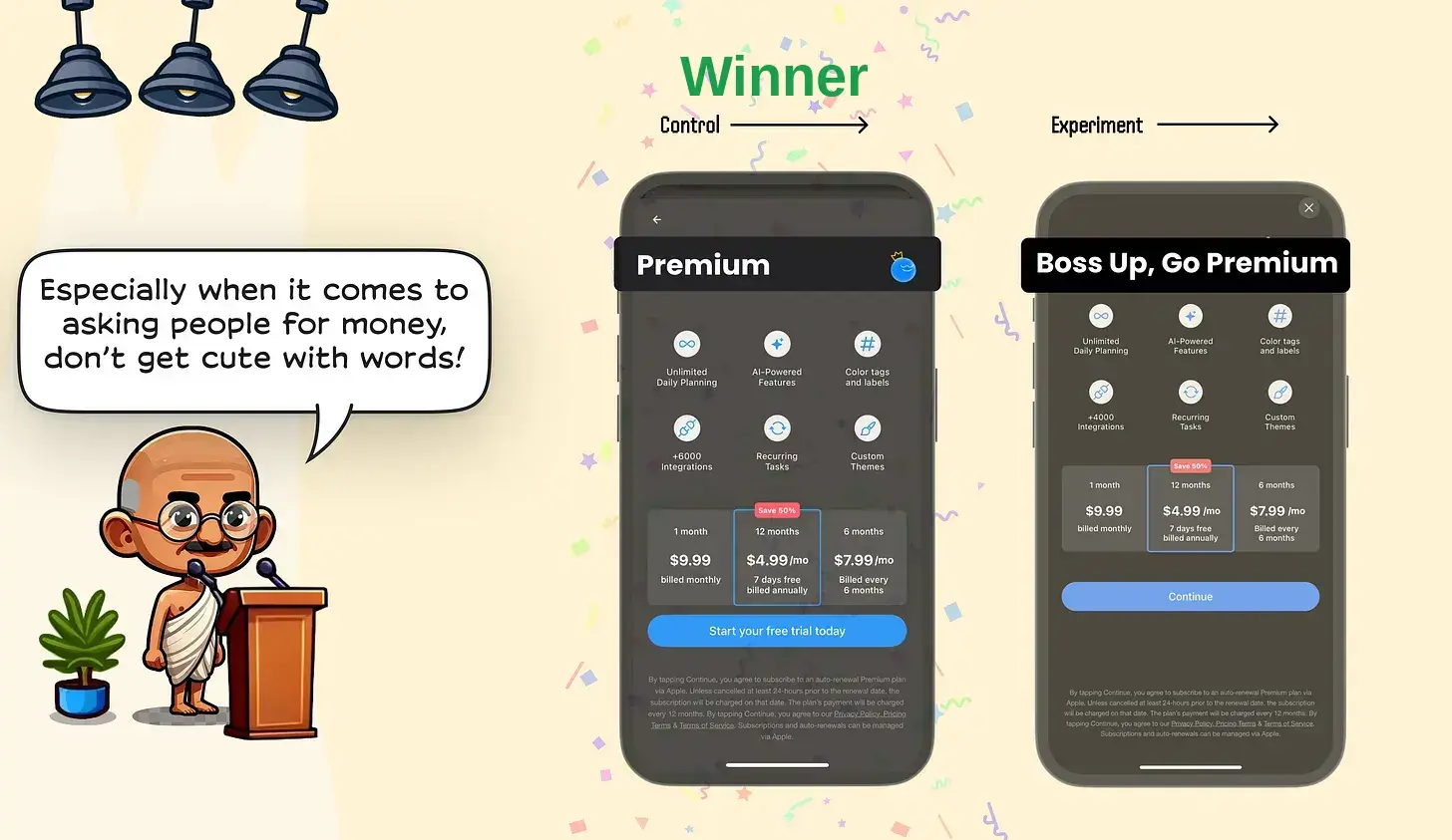
Any.do’s paywall copy got less free trials when it was made more playful. The playfulness was distracting. The winning design also had a clearer CTA button.
Takeaways
- Consider removing or simplifying the navigation on critical pages (I removed the navigation from my SEO course’s sales page).
- Make everything friendly for lazy minds (people will refuse to think and bounce instead).
- Simplify copy. Make it direct and concise.
- Give one big obvious button when possible.
- Don’t get cute with words, especially when it involves money.
- Remove distracting visuals.
- Use a lot of empty space.
- Put your call-to-action in the top section, before people start scrolling.
- Reduce form fields a lot.
- One strong image beats many weak images.
I’m learning from writing this article
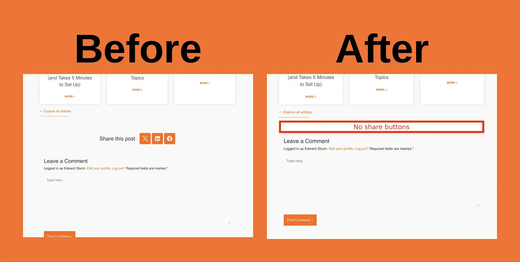
As I was writing this, I cut the share buttons from my articles (not many people use them). CUT WHEN YOU CAN.
AI is hurting you
I made this video about how AI sites throw in a HUGE amount of unnecessary text, hiding the critical elements in fluff.
- AI repeats itself A LOT.
- AI adds many unnecessary words to sentences.
- AI doesn’t prioritize what user most cares about.
- AI uses words as images – but people want to look at images so they don’t have to read and so they can understand faster and easier.
- AI adds too many buttons, hiding the single one visitors SHOULD click.
- AI pushes the critical elements way down your pages, when the critical elements NEED to be at the top.
Whether you’re using AI to make websites or just to write social media posts, keep the lessons from this article in mind.
You get more by simplifying.
SEO Conversion Pages
My course shows you specifically how to make SEO pages designed to convert searchers into:
- Users
- Paying customers
- Warm leads calling you up
This means one clear CTA above-the-fold, clear direct text, clear images, empty space – everything we covered in this article.
I also show you how to structure your sites for these conversion-based SEO pages, how to find keywords where people are looking to become users, customers, leads, how to do an SEO technical audit, templates, examples in every niche, step-by-step breakdowns, and a lot more.
Compact Keywords, my course, is about making money with SEO – not getting low-converting blog traffic.
Everybody tries to overcomplicate SEO.
I show you how to simplify it into what will move the needle and drive sales.
Get it at: https://edwardsturm.com/compact-keywords/