
I spent 2 hours today Googling how to make animated shiny text with css – so I’m going to write it here to save some poor soul like me from future pain.
You’re welcome.
The Effect
This is the effect:
Look at me I’m all shiny!
It works better with short text:
FAVS!
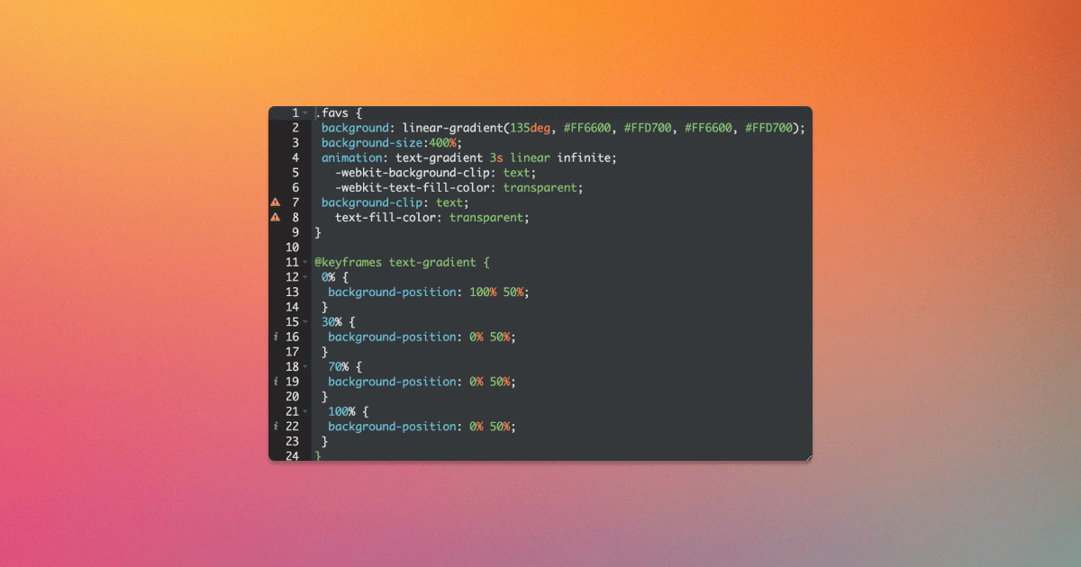
How it's done
Here’s how it’s done:
					.insertclasshere {
 background: linear-gradient(135deg, #FF6600, #FFD700, #FF6600, #FFD700);
 background-size:400%;
 animation: text-gradient 3s linear infinite;
   -webkit-background-clip: text;
   -webkit-text-fill-color: transparent;
 background-clip: text;
   text-fill-color: transparent;
}

@keyframes text-gradient {
 0% {
  background-position: 100% 50%;
 }
 30% {
  background-position: 0% 50%;
 }
  70% {
  background-position: 0% 50%;
 }
  100% {
  background-position: 0% 50%;
 }
}
These are the variables I’d most recommend playing around with, if you don’t like exactly what I have above.
To change the colors, adjust:
#FF6600, #FFD700, #FF6600, #FFD700
To change the speed, adjust:
3s
					30%
70%
To see the effect without filling the text color, remove “text” after “background-clip.” Then it will just be an animated color changing box.
The journey
I spent so long figuring this out today because I wanted the text below to be shiny rather than corny.
This was the first effect I found:
					.cornyeffectmeh {
 background: linear-gradient(45deg, #FF6600, #FFD700, #FF6600, #FFD700);
 background-size:400%;
 animation: text-gradient 3s ease infinite;
 padding:5px 0;
   -webkit-background-clip: text;
   -webkit-text-fill-color: transparent;
 background-clip: text;
   text-fill-color: transparent;
}

@keyframes text-gradient {
 0% {
  background-position: 0% 50%;
 }
 50% {
  background-position: 100% 50%;
 }
 100% {
  background-position: 0% 50%;
 }
}
This is what this one looks like:
This is a corny effect.
This one was not what I was looking for because it loops, but in a non-shiny way.
This one just looks corny. Especially when the text is shorter, which was my specific use case:
FAVS!
I wanted shiny.
If you want shiny too, go back to the first example for shiny.
But I played around with this second example for hours before getting the first effect in this article.
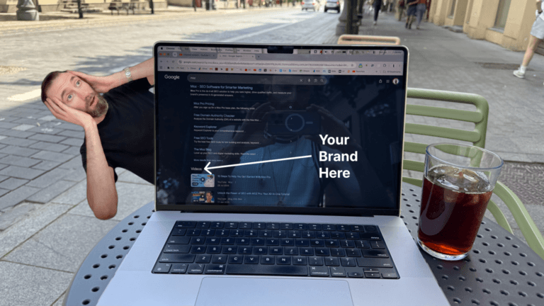
I did this so I could have the “FAVS” in my header be all shiny to bring attention to my favorite articles:
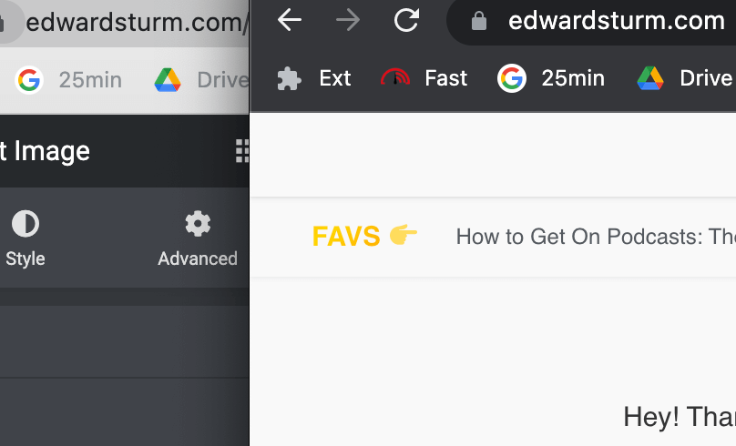
This is right underneath my standard header with my logo and primary call-to-action.
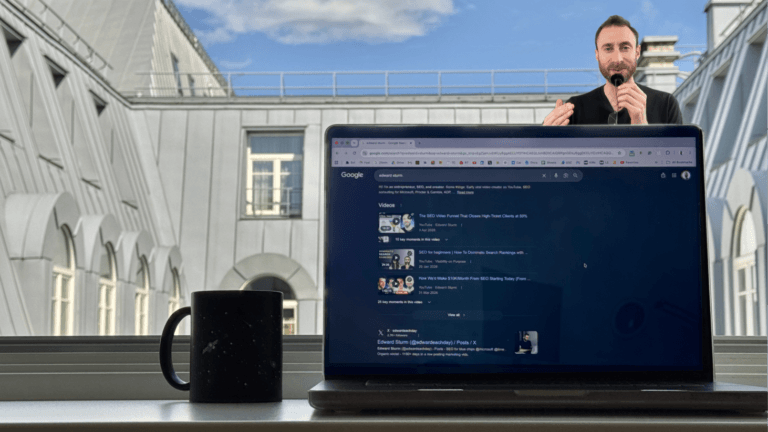
However, after spending over 2 hours on this effect, I realized this top bar may actually distract from the rest of the call-to-actions on my website.
So I wondered if I should strike it. We’ll see; TBD.
But if I strike it after all that work, I can at least use the lessons I got for some Internet traffic.
So hence, this article.
I seriously hope it saves you time, stress, and existential dread.
If only I’d found this right away instead of getting caught up in the sunk cost fallacy bias.
If you have any feedback on this, by the way, please share in the comments!
Stay shiny like this guy.